Publication date: 01-02-2025 | Update date: 01-02-2025 | Author: Mateusz Ciećwierz

-
Online courses
- All
 3ds Max
 AI - Artificial Intelligence
 Blender
 Corona renderer
 GstarCAD
 LayOut
 Photoshop
 Interior Design
 Revit
Revit Sketchup
 Stable Diffusion
 V-ray
V-ray
"Online courses" are comprehensive online training programs that will help you quickly master the software you are interested in.
- Plugins
- 3D Models
- Help
- Articles
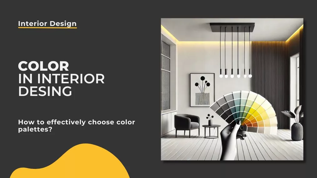
Color in Interior Design - How to Effectively Choose Color Palettes?
Color is one of the most important elements in interior design. It influences not only the aesthetics of a room but also our well-being, mood, and perception of space. Well-chosen color palettes can optically enlarge the interior, give it coziness, or emphasize its functionality. So how to effectively choose colors for interiors?
Index
Key conclusions:
- Color influences emotions and the optical perception of space.
- The choice of color palette should take into account the function of the room and the lighting.
- The principles of color theory help in harmoniously combining colors.
- Color trends change, but it is crucial to adapt the colors to the interior style and individual preferences.
Fundamentals of Color Theory in Interior Design
Color is not just a matter of aesthetics - its choice is based on scientific principles of color theory. It's important to understand basic concepts such as:
- Color wheel - a graphic representation of colors and their mutual relationships. It helps understand which colors go well together. Thanks to this, interior designers can effectively combine colors, avoiding random and inconsistent combinations.
- Warm and cool colors - warm colors (reds, yellows, oranges) add energy and dynamic to interiors, while cool colors (blues, greens, purples) have a calming effect. Warm colors work well in spaces requiring stimulation, such as kitchens and dining rooms, while cool shades are ideal for bedrooms and bathrooms, where relaxation is crucial.
- Neutral colors - whites, grays, and beiges form an excellent base for more expressive color accents. Neutral colors are extremely versatile, easy to combine with other colors, and often serve as a background for more dynamic interior elements, such as furniture or decorations.
- Contrasts and harmony - using complementary colors (e.g., blue and orange) can add vibrancy to an interior, while analogous colors (e.g., various shades of green) create a harmonious atmosphere. Contrasts help bring out details and give character to a room, while harmonious color combinations are crucial in designing calming interior spaces.
- Achromatic colors - black, white, and shades of gray give interiors a modern and elegant character. These colors are often used in minimalist, Scandinavian, and industrial arrangements, where simplicity and functionality play a key role. Excessive use of black can be overwhelming, so it's worth combining it with lighter shades to achieve a balanced effect.
- Color psychology - colors influence emotions: blue has a calming effect, yellow stimulates creativity, and red adds energy. It's important to remember that some colors may have different effects depending on culture and personal preferences. For example, in Eastern cultures, red symbolizes happiness and good fortune, while in other contexts it may be associated with aggression. Green often symbolizes harmony and closeness to nature, making it popular in offices and workspaces.

How to Choose Colors According to Room Function?
Each room in the house has a different function and requires a suitable color scheme:
- Living Room - neutral colors with warm accents work best. Beiges, grays, and pastels create a cozy atmosphere, and stronger accents like shades of green or navy add character. Experimenting with shades of green or navy can also add elegance.
- Kitchen - light colors, such as white or light green, create a clean and fresh space. Reds and yellows can stimulate appetite, but it's best to use them moderately, as accents on walls or accessories.
- Bedroom - pastel blues, purples, and greens have a calming effect, aiding relaxation. It's best to avoid intense colors that may disrupt sleep and opt for subtle and neutral shades.
- Bathroom - light shades of blue and white add a feeling of freshness and cleanliness. Modern arrangements often include grays and beiges, giving the space an elegant character.
- Home Office - greens and blues promote concentration, while subtle shades of gray and beige create a professional work environment. Well-chosen colors can increase productivity and efficiency.
- Children's Room - stimulating colors like pastel yellow, mint, or light pink can be used to encourage development. Avoiding overly bright colors allows for a space that is conducive to both play and rest.
- Entryway - light and neutral colors work best, adding visual spaciousness. It's a good idea to add color accents, such as wallpaper, to give the interior a unique style.

Principles of Harmonious Color Combination
To ensure that colors work well together, several proven principles can be applied:
- The 60-30-10 rule - 60% of the interior should be the dominant color, 30% the complementary color, and 10% the accent color. This method helps achieve an aesthetic balance, avoiding an overabundance of one color. The dominant color can appear on walls or larger surfaces, the complementary on furniture, and the accent in accessories and decorations.
- Monochromatic color scheme - choosing one color in various shades creates a cohesive and elegant space. This solution works well in minimalist and modern arrangements, giving them a refined look. An example could be combining different shades of blue, introducing a sense of calm and harmony.
- Complementary colors - choosing colors that are opposite each other on the color wheel (e.g., blue and orange) allows for a dynamic contrast. This is a great solution for energetic and characterful interiors. It's important to use intense colors in moderation to avoid overwhelming the space.
- Analogous colors - combining neighboring colors on the color wheel (e.g., yellow, orange, and red) creates gentle harmony. This technique is often used in nature-inspired arrangements, for example, shades of green like grass, olive, and moss create a relaxing effect.
- Gradients and tonal transitions - smooth transition between shades allows for a modern effect. This solution is particularly effective in bohemian and eclectic styles, where gradient colors add depth and an interesting look. Gradients can be achieved on walls and in accessories, such as textiles or paintings.
The Influence of Light on Color Perception
Light plays a crucial role in how colors are perceived in a room and can completely change the way they are perceived:
- Natural light - makes colors appear more authentic and vivid. Depending on the time of day and the direction of light, colors may seem more intense or subdued. Rooms with a north-facing exposure tend to adopt cooler hues, while those facing south gain a warm, golden glow.
- Artificial light - can significantly alter the perception of colors. Bulbs with a warm tone bring out warm shades, giving the interior a cozy atmosphere, while cool light emphasizes cold colors, lending a more modern and sterile character to the space. Choosing the right color temperature for bulbs is crucial for the atmosphere of the interior.
- Directional lighting - spotlights, LEDs, or reflectors can highlight specific decorative elements, such as paintings, decorative walls, or material textures. This allows for creating depth and additional division of space.
- Room-specific lighting - different types of lighting are used in different spaces. Neutral lighting is useful in bathrooms, allowing for the realistic representation of colors, which is particularly important for daily grooming. Warm lighting is often used in living rooms, promoting relaxation and creating a cozy atmosphere. In offices and workspaces, cool or neutral lighting is favorable, supporting concentration and reducing eye strain.
- Wall color and light reflection - light surfaces reflect more light, making the interior feel more spacious and bright. Conversely, dark colors absorb light, making the space more intimate, albeit reducing its visual size.
The choice of appropriate lighting for the interior is crucial for achieving the desired visual effect and atmosphere. Therefore, when designing lighting, it is valuable to consider both natural and artificial light sources and their impact on the colors in the room.

Summary
Color in interior design has a huge impact on the atmosphere and functionality of spaces. When choosing the right color palette, it's important to rely on color theory, the influence of light, and the function of the specific interior. Well-chosen colors can make the space not only aesthetically pleasing but also conducive to comfort and well-being. Regardless of current trends, it's crucial to match the color scheme to personal needs and lifestyle. Skillful color combinations allow for creating a harmonious, functional, and beautiful space that meets all the residents' expectations.
Author

Read on our blog
-
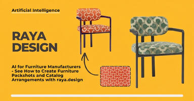
![AI for furniture manufacturers - See how to create furniture packshots and catalog arrangements with raya.design]()
AI for furniture manufacturers - See how to create furniture packshots and catalog arrangements with raya.design
Packshots without time-consuming sessions? Discover Raya Design. Change upholstery and create arrangements with AI in moments. See how it works! -
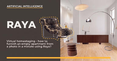
![Virtual AI home staging - how to furnish an empty apartment from a photo in one minute using Ray?]()
Virtual AI home staging - how to furnish an empty apartment from a photo in one minute using Ray?
Fast interior transformation without 3D modeling? Meet Ray Design. Furnish an empty apartment from a photo in one minute with AI. Come in and see how it works! -
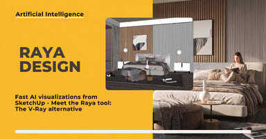
![Quick AI visualizations from SketchUp - Meet Raya: an alternative to V-Ray]()
Quick AI visualizations from SketchUp - Meet Raya: an alternative to V-Ray
Done with tedious V-Ray? Test Raya Design in SketchUp! Create photorealistic interior visualizations without prompts. Click to find out! -
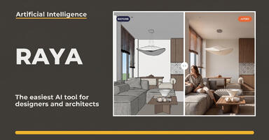
![Raya - The simplest AI tool for designers: zero prompts, maximum control!]()
Raya - The simplest AI tool for designers: zero prompts, maximum control!
Try raya.design for free! Get 20 credits to start and create photorealistic 3D visualizations without prompts. Click to check it out!